A well-curated gallery wall can transform any space, bringing personality, creativity, and structure to an otherwise blank wall. Whether you prefer a modern, eclectic, or classic approach, the key lies in how you mix frames, canvases, and themes to create a visually appealing and cohesive display.
Mixing Frames for Depth and Contrast
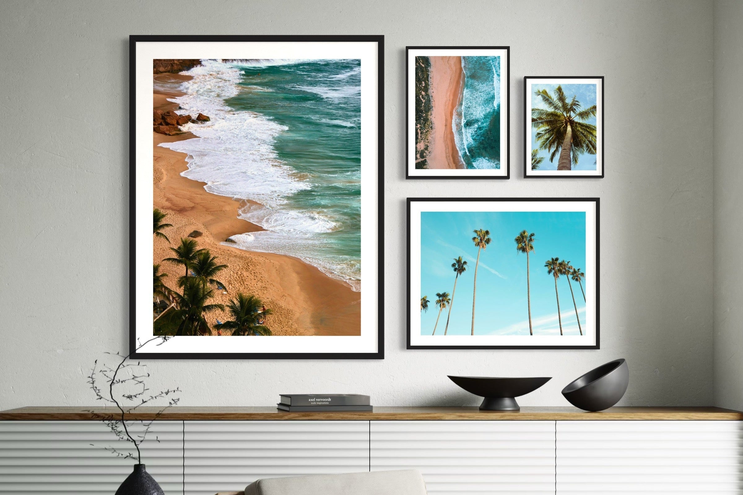
Using different colored frames can add layers of interest to your gallery wall. Black, white, or light and dark wood-toned frames can help create contrast, define a theme, or complement your existing decor. While a uniform frame color creates a polished look, mixing different hues and finishes introduces a more dynamic and collected-over-time aesthetic.
The Power of White Borders (White Margins)
White borders, also known as white margins, are an essential tool in making your gallery wall feel balanced and less cluttered. When used in framed posters, white margins create breathing room around the artwork, preventing a visually overwhelming arrangement. They can also help connect diverse themes and pieces, making them feel unified despite differences in size or color.
Combining Canvases with Framed Posters
To add variety and texture, consider incorporating both canvases and framed posters. Thick gallery-wrapped canvases can provide a bold, contemporary presence, while thin, framed posters add a refined touch. The interplay between these different materials brings a sense of depth and visual movement to your gallery wall, ensuring it doesn’t feel flat or monotonous.
Curating Themes for a Cohesive Look
A well-thought-out theme helps tie your gallery wall together. While sticking to one theme is an option, mixing related themes can make your display more intriguing. For example, nature-themed wall art can be paired with wildlife photography, or mid-century modern designs can be complemented with typography art. The contrast between structured typography and organic nature elements creates a well-balanced visual experience.
Contrasting Wall Colors with Frames
The color of your wall plays a crucial role in how your gallery wall is perceived. Dark walls make white and light-colored frames pop, while lighter walls allow for bolder, darker frames to stand out. If your goal is a subtle, elegant look, consider using frames that blend into the wall color. For a more striking effect, opt for high-contrast combinations that highlight each piece.
A Foundation for More Advanced Styling
This introduction to gallery wall basics lays the foundation for more detailed discussions on arrangement techniques, frame selection, spacing, and layout ideas. Future posts will explore these topics further, offering inspiration for crafting a gallery wall that reflects your personal style and enhances your space.
By thoughtfully combining frames, utilizing white margins, blending different materials, curating themes, and considering wall contrast, you can create a gallery wall that is both visually captivating and uniquely yours.